
How to Build a Brand Identity for Your Startup on a Small Budget
You don't need a big agency budget to look credible. Here's a practical, step-by-step way for startups and SMEs to build a consistent brand identity: positioning, voice, logo, colours and templates.
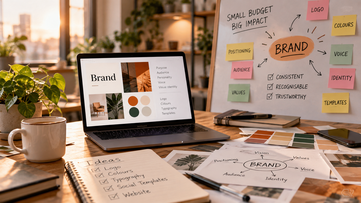
Most founders think of branding as a logo, and a logo as something that costs a lot of money. So the whole subject gets pushed down the to-do list until the first proposal goes out with a mismatched deck, a different colour on every social post, and a website that sounds like a different company. Customers rarely say "your branding is inconsistent". They just feel less sure about you.
The good news is that a credible brand identity is mostly a matter of clear decisions made once and applied everywhere. You can do most of it yourself in a week or two, with a small budget, if you do the thinking in the right order. This guide walks through that order.
Start with positioning, not visuals
Before you pick a colour or a font, write down what you want to be known for. Visual choices are easy to change; a muddy position is not. Spend your first hour on the questions below.
Answer four plain questions
- Who exactly are you for? A specific type of customer, not "everyone".
- What problem do you solve for them, in their words?
- Why would they choose you over the obvious alternative, including doing nothing?
- What three words should a customer use to describe you after the first meeting?
Turn the answers into one sentence
Combine them into a single positioning line: "We help [who] to [outcome] without [main frustration]." It won't necessarily appear on your website word for word, but it becomes the filter for every later decision.
Define your brand voice
Voice is the cheapest part of a brand and often the most noticeable. Pick three adjectives, such as "direct, warm, practical", and write one example sentence for each showing how you would and wouldn't say it. For instance, a practical voice says "Your quote will arrive within two working days", not "We strive to revert at the earliest".
Keep this in a short note that anyone writing for you, including freelancers and future hires, can read in two minutes.
Build the visual basics
You need far less than a full brand book. Five elements cover most small businesses.
Logo
A clean wordmark (your name set in a good typeface) is often better than a clumsy symbol. If you hire a freelance designer, expect a realistic range of roughly ₹5,000 to ₹40,000 depending on experience and scope; this is an estimate, so get two or three quotes. Make sure you receive editable files and a version that works on both light and dark backgrounds.
Colours
Choose one primary colour, one neutral for text and one accent for buttons and highlights. Save the exact hex codes. Check that your text colour has strong contrast against its background so it stays readable on phones.
Fonts
Use at most two: one for headings and one for body text. Free libraries such as Google Fonts have plenty of professional options, and they load reliably on websites.
Imagery style
Decide what your photos and graphics should feel like: real photos of your team and work, simple icons, or clean illustrations. Consistency matters more than polish. A handful of your own photos, well lit, beats generic stock images.
Layout habits
Generous white space, left-aligned text and one consistent button style already make a business look organised.
Turn decisions into reusable templates
A brand only works if it is easy to apply. Once your basics are set, build templates in a free or low-cost design tool so nobody has to start from scratch. Prioritise these:
- Proposal or quotation document and pitch deck
- Social media post and story layouts
- Email signature and invoice layout
- Business card or WhatsApp Business profile details
Apply it consistently across touchpoints
List every place a customer meets you: website, Google Business Profile, LinkedIn, Instagram, WhatsApp, invoices, packaging, even the way phones are answered. Update the highest-traffic ones first, usually the website homepage and the Google and LinkedIn profiles. Then update the rest over a few weeks rather than in one exhausting push.
Do a simple consistency check
Open five of your public pages side by side. Do they look and sound like the same company? If someone covered the logo, could they still tell? Fix the biggest mismatch first and repeat.
Common mistakes to avoid
- Copying a competitor's look. It makes you easy to confuse with them rather than easy to remember.
- Changing the brand every few months. Consistency over time is what builds recognition.
- Using too many colours and fonts because each one looked nice on its own.
- Skipping the written voice guidance, then wondering why every team member sounds different.
- Paying for a full brand book before you know who your best customers are.
A realistic timeline and budget
As a rough estimate, a founder working alone can finish positioning and voice in a day, visual basics in two to three days, and templates in another two. Cash costs can stay under a modest amount if you use free tools and pay only for a logo or a designer's review. The real investment is your time and the discipline to stick with the decisions.
Ready to build a brand customers remember?
If you'd like a second pair of eyes on your positioning, visuals or website, we're happy to help you sort out the essentials and avoid expensive detours. Book a free consultation and let's map out a brand that fits your business and your budget.